We have Bifurcated the topic Data handling and Interpretation (charts, graphs, tables, data sufficiency etc.) into following topics for exhaustive study:-
- Data Analysis – Mathematical operation Basic numeracy (numbers and their relations, orders of magnitude etc.)
- Data interpretation (charts, graphs, tables, data sufficiency etc.) and analysis of data.
- Data Collection Analysis- Interpretation- Collection, Interpretat ion and Appreciation of Statistical Data
- Study of Graphs and Charts:– Bar Graphs, Line Graphs and Pie Charts-
- Problems Based on Tabular and Diagrammatical Data-
- Data Sufficiency in Statistics
Data interpretation
Data Interpretation or DI refers to the implementation of procedures through which data is reviewed for the purpose of arriving at an inference. Data can be obtained from multiple sources e.g. data from running of industries, census population data etc. Interpreting data requires analyzing data to infer information from it in order to answer questions. Data can be provided in a number of formats viz: Bars, tables, line graphs, pie graphs.
Bar Graphs
A bar graph or bar chart represents explicit data with rectangular bars. The heights and lengths of these bar graphs are proportional to the values of data they represent. There are two types of bar graph, one is called horizontal bar graph and other is called vertical bar graph. The important thing to remember is that the longer the bar, the greater its value. Bar graphs made up of two axis, one is called x- axis and other is called y- axis. In a horizontal bar graph, y-axis shows the data categories and x- axis shows the scale. In vertical bar graph, x-axis shows the data categories and y-axis shows the scale. In a nutshell, we can compare easily different sets of data between different groups with the help of bar graph.
Tables
In tables, data is described in the form of rows and columns. In DI table’s questions, we are required to read data from table/tables analyze the data and answer the questions asked on the basis of the given data.
DI Questions based on Tables are very common in competitive exams. Rows and Columns of tables consist of various types of data like income of company, expenditure on various items, and marks of Applicants and so on. First column and row of tables represent the titles. Level of Questions in Tables may be lower or higher in comparison of other graphs form, depending on given data in the table and the way,questions are framed.
Line Graphs
A line graph basically is used to visualize values over a certain time period. It is basically used to change over time as various points of data connected by straight line on two axes. It helps to determine the relationship between two sets of values; and also one data set is always dependent on the other set. In many competitive exams, you will see various questions based on line chart problems, in which you are supposed to analyze the data and then answer them.
Pie Charts
Pie charts are circular shaped graphs which are divided into sectors to represent numerical proportions. In a pie chart, the central angle of a particular sector is proportional to the quantity it represents. In other words, we can say a Pie Chart resembles a Pie in which a circle is cut in various sized sectors from center to the boundary. In simple words, the bigger the sector, the higher the proportion.
Bar graphs
A Bar Graph (also called Bar Chart) is a graphical display of data using bars of different heights.
Imagine you just did a survey of your friends to find which kind of movie they liked best:
| Table: Favourite Type of Movie | ||||
| Comedy | Action | Romance | Drama | SciFi |
| 4 | 5 | 6 | 1 | 4 |
We can show that on a bar graph like this:
Pie charts
The formula to determine the angle of a sector in a circle graph is:
Angle of sector = Frequency of data / Total frequency × 360°
Example:
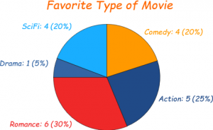
Imagine you survey your friends to find the kind of movie they like best:
| Table: Favourite Type of Movie | ||||
| Comedy | Action | Romance | Drama | SciFi |
| 4 | 5 | 6 | 1 | 4 |
You can show the data by this Pie Chart:
It is a really good way to show relative sizes: it is easy to see which movie types are most liked, and which are least liked, at a glance.
Next, divide each value by the total and multiply by 100 to get a percent:
| Comedy | Action | Romance | Drama | SciFi | TOTAL |
| 4 | 5 | 6 | 1 | 4 | 20 |
| 4/20 = 20% |
5/20 = 25% |
6/20 = 30% |
1/20 = 5% |
4/20 = 20% |
100% |
Now to figure out how many degrees for each “pie slice” (correctly called a sector). A Full Circle has 360 degrees, so we do this calculation:
| Comedy | Action | Romance | Drama | SciFi | TOTAL |
| 4 | 5 | 6 | 1 | 4 | 20 |
| 20% | 25% | 30% | 5% | 20% | 100% |
| 4/20 × 360° = 72° |
5/20 × 360° = 90° |
6/20 × 360° = 108° |
1/20 × 360° = 18° |
4/20 × 360° = 72° |
360° |
Data Sufficiency in Statistics
A sufficient statistic is a statistic that summarizes all of the information in a sample about a chosen parameter. For example, the sample mean, x̄, estimates the population mean, μ. x̄ is a sufficient statistic if it retains all of the information about the population mean that was contained in the original data points.
Let X1, X2, …, Xn be a random sample from a probability distribution with unknown parameter θ. Then, the statistic:
Y=u(X1,X2,…,Xn)
is said to be sufficient for θ if the conditional distribution of X1, X2, …, Xn, given the statistic Y, does not depend on the parameter θ.
Guidelines to solve questions
In each of the questions below consists of a question and two statements numbered I and II given below it. You have to decide whether the data provided in the statements are sufficient to answer the question. Read both the statements and give answer.
- If the data in statement I alone are sufficient to answer the question, while the data in statement II alone are not sufficient to answer the question
- If the data in statement II alone are sufficient to answer the question, while the data in statement I alone are not sufficient to answer the question
- If the data either in statement I alone or in statement II alone are sufficient to answer the question
- If the data given in both statements I and II together are not sufficient to answer the question and
- If the data in both statements I and II together are necessary to answer the question.
Example of Data sufficiency
Question: In which year was Rahul born ?
Statements:
- Rahul at present is 25 years younger to his mother.
- Rahul’s brother, who was born in 1964, is 35 years younger to his mother.
| A. | I alone is sufficient while II alone is not sufficient |
| B. | II alone is sufficient while I alone is not sufficient |
| C. | Either I or II is sufficient |
| D. | Neither I nor II is sufficient |
| E. | Both I and II are sufficient |
Answer E
Explanation:
From both I and II, we find that Rahul is (35 – 25) = 10 years older than his brother, who was born in 1964. So, Rahul was born in 1954.
Pie-chart
A pie graph (or pie chart) is a specialized graph used in statistics. The independent variable is plotted around a circle in either a clockwise direction or a counterclockwise direction.The dependent variable (usually a percentage) is rendered as an arc whose measure is proportional to the magnitude of the quantity.Each arc is depicted by constructing radial lines from its ends to the center of the circle, creating a wedge-shaped “slice.”The independent variable can attain a finite number of discrete values (for example, five).The dependent variable can attain any value from zero to 100 percent.
The illustration is a pie graph depicting the results of a final exam given to a hypothetical class of students.Each grade is denoted by a “slice.”The total of the percentages is equal to 100 (this is important; if it were not, the accuracy of the graph would be suspect).The total of the arc measures is equal to 360 degrees.
From this graph, one might gather that the professor for this course was not especially lenient nor severe.It is evident that grading was not done on a “pure curve” (in which case all the arcs would have equal measures of 72 degrees, corresponding to 20%).If this graph were compared with those of classes from other years that received the same test from the same professor, some conclusions might be drawn about intelligence changes among students over the years.If this graph were compared with those of other classes in the same semester who had received the same final exam but who had taken the course from different professors, one might draw conclusions about the relative competence and/or grading whims of the professors.
Example
Imagine you survey your friends to find the kind of movie they like best:
| Table: Favourite Type of Movie | ||||
| Comedy | Action | Romance | Drama | SciFi |
| 4 | 5 | 6 | 1 | 4 |
Pie chart representation of above table
Probability
Probability is simply how likely something is to happen.
Whenever we’re unsure about the outcome of an event, we can talk about the probabilities of certain outcomes—how likely they are. The analysis of events governed by probability is called statistics.
Tossing a Coin
When a coin is tossed, there are two possible outcomes:
heads (H) or tails (T)
We say that the probability of the coin landing H is ½ And the probability of the coin landing T is ½.
Throwing Dice
When a single die is thrown, there are six possible outcomes: 1, 2, 3, 4, 5, 6.
The probability of any one of them is 16
Number of ways it can happen
Probability of an event happening = ________________________
Total number of outcomes